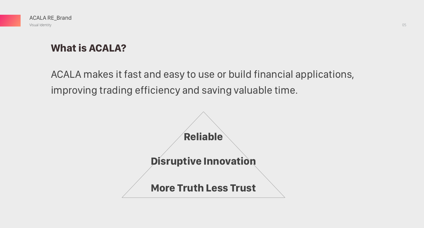
Rebranding Acala Network with the first ever Deepwork's Branding Hypersprint.
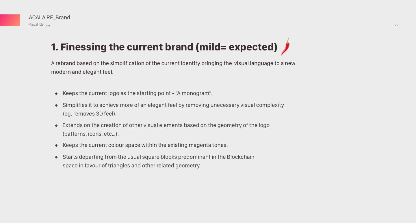
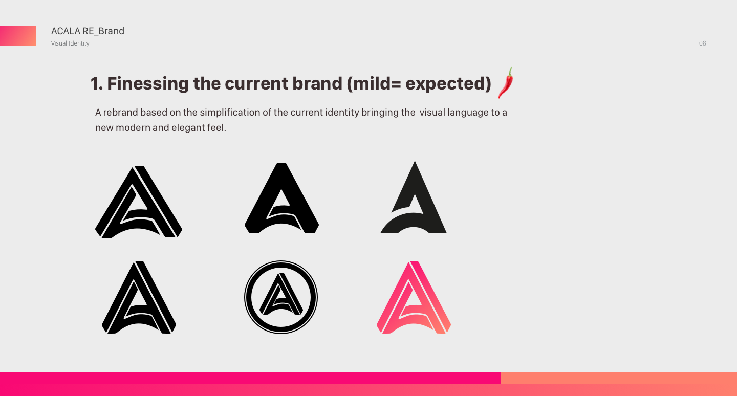
INTRO
Acala is the DeFi Hub for Polkadot. It is a decentralized finance network powering the aUSD ecosystem. It's a layer-1 smart contract platform that's scalable, Ethereum-compatible, and optimized for DeFi. With the Acala EVM+, Acala lets developers leverage the aUSD ecosystem while enjoying the best of Ethereum and the full power of Substrate.
GOAL
To re-brand the Acala Network in a way that the protocol can be perceived as trustworthy, inclusive, open while showcasing its disruptive and innovative nature of not being developed on ethereum.
PROCESS
Deepwork Studio has a record for being able to tap into product design specifically for clients in the crypto/blockchain industry. Nevertheless they never had to work on branding and identity development up to this point. Acala was the very first client that gave us the opportunity to start playing and experimenting with fine-tunning the hypersprint process to meet our needs.
For this reason we decided to add more time to the structure of the usual sprint to allow to work on the Acala visual identity prior to jumping into the landing page work.
We started the whole process with a 4h workshop dedicated to align all participants. We interviewed the client, identified and prioritized challenges, defined long term goal, refined a one-liner, brand attributes, tagline and finally did some visual research to gather inspiration on how to visually bring the identity to life.
Some notes from that day's workshop:
Once we finished the 1st day I had a good feel about the brand and was able to gather my thinking into a small presentation so I could continue tapping a bit more and find out how far were they willing to go with the re-brand. I presented three distinctive flavours: mild, medium and spicy hot!!
The client decided to go with the milder option and so we started laying out possible routes on how to carve slight nuances around this direction. We presented 3 options and the client ultimately went with Concept 03 as this one provided a friendlier and softer tone that felt more linked to what they were invisioning for Acala.
We had the client decided on the symbol and possible final lockup (with option 03) but weren't fully convinced on the color scheme. So they wanted us to keep exploring things this time around the pink and purple tones. They also wondered whether there was room to explore other slight nuances in the symbol that could add value to what we already had.
RESULTS
In the end the client felt more inclined to the previous explored tones around orange and mangenta, which better represented the vibrancy they wanted to bring across. We ended up with a final execution that feels minimal and bold but striking enough to represent the disruptive and innovative nature of Acala.
Digital Brand Guidelines (selected stills)
CREDITS
DIRECTION
Bruno Dias
DESIGN
Bruno Dias
FACILITATION
Andrej Berlin
CLIENT
Acala Foundation
STUDIO/AGENCY
Deep Work Studio