WILDFISH
Re-Wilding the Coolest Fishes.
Rebranding a London based development consultancy to distinguish in a cool & quirky way.


01. Flat, human and simple.


02. Complex tech isomorphic.


03. Abstract quirky. arty & fun.


Wildfish Site Map

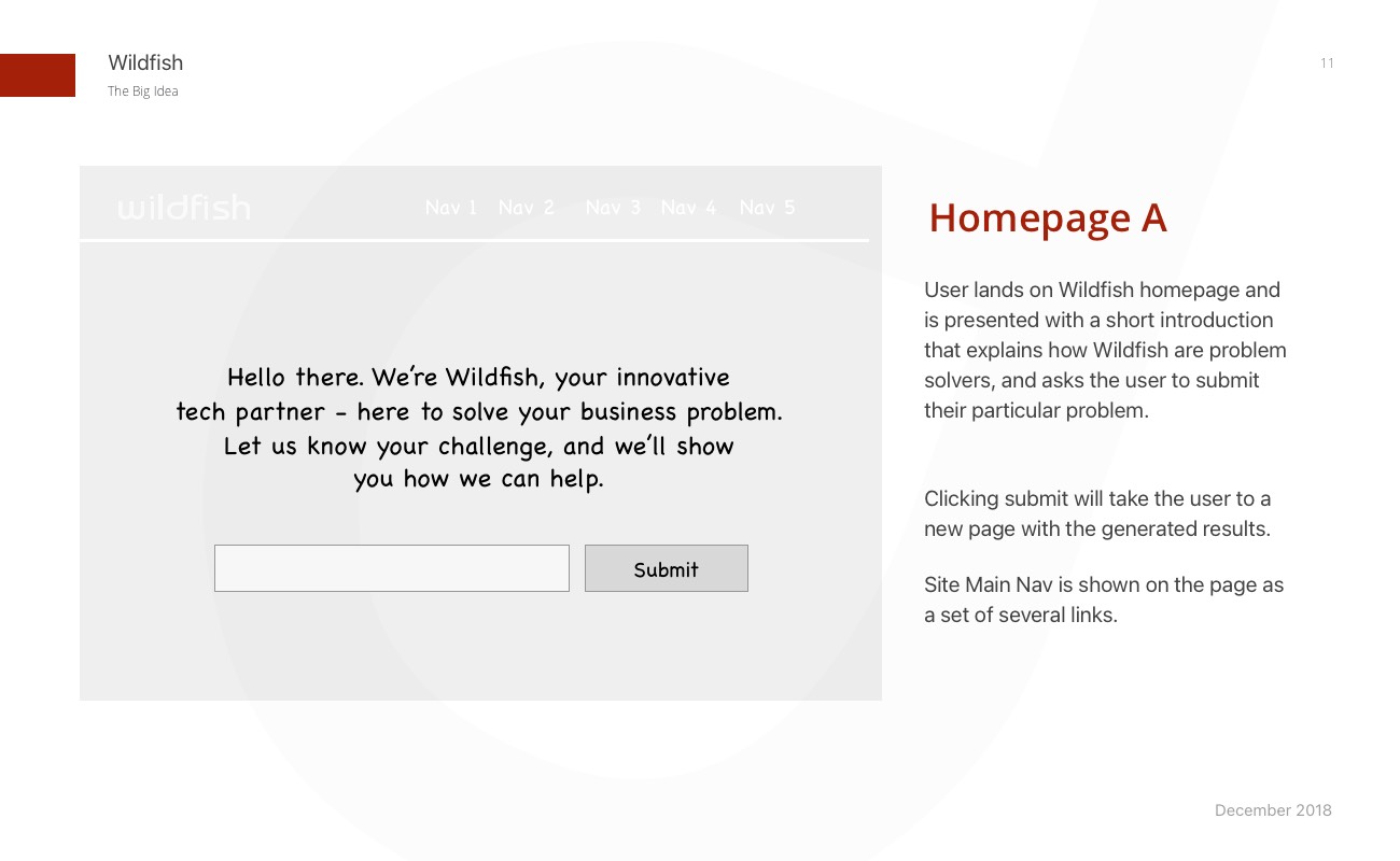
Selected wireframes


DIRECTION
Carolyn Stone
ART DIRECTION
Bruno Dias
DESIGN & ILLUSTRATION
Bruno Dias
projects
Type
©BRUNODIAS 2025
INFO@BRUNODIAS.ME
+34 600 375 047